Feeling pushed around? Listen to your users.
Stikis user benmcg has written a thoughtful post in the stikis forum (the forum requires a separate login at this stage) suggesting a better way for the zooming to work in stikis. In the post, he points out that because the page is centered on the spot where you zoomed, you can’t leave your mouse still and keep zooming in on the same point. The following diagram shows what happens
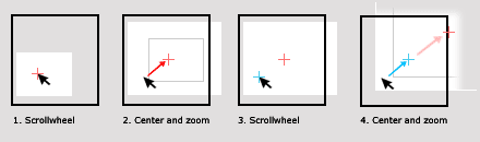
You can see here how if the user leaves their mouse in the same position, each time they scroll, the original spot they scrolled over gets moved further away. Benmcg points to the way scroll-zooming works in computer aided design (CAD) software for a better alternative. In the software that benmcg uses, the screen isn’t centered on the position where the user zoomed. The drawing is just zoomed around that spot. Again, a diagram helps to illustrate.
Benmcg also sent a ‘screencast’ (3Mb) of him zooming around in his CAD program, this also gives a fairly good idea of how it works.
After reading benmcg’s post and watching the movie he sent, I thought he had a valid point and that zooming in stikis would be better if it worked in the way that he described. So far, I’ve only made a first-cut at it but already the difference is striking. Now that I go back to the existing stikis interface, I feel like it’s pushing me around and telling me where to look.
I’ve checked back with how web-based mapping software (my point of reference for ui conventions) handles zooming and found that Google Maps works in the way that benmcg describes, while Yahoo Maps and Microsoft Live maps just zoom from the center of the screen without panning the map.
So why didn’t I do it like this in the first place? One reason, was it’s simpler to program if the zoom origin remains at the center of the screen, so to zoom in on a particular spot I chose to move the spot to the origin. I also thought (or told myself) that centering on the position that the user scrolled would be bringing their point of attention into the center and that this would be a good thing. I guess sometimes you can’t know how something should work until someone steps up and tells you how to change it.
Because I’ve only made a first-cut at these changes, they aren’t ready for the live site yet. I hope to have the changes tested and ready to deploy some time later in the week and I’ll post an article here when they’re up. In the mean-time, if there’s something about the interface that’s pushing you around, please let me know.
Up, Down, In, Out
A related point, (I’m not sure if benmcg metions this in his forum post) is that the conventions for whether scrolling up should zoom in or out vary from program to program. In stikis, I’ve followed the convention of web-based mapping sofware (which seems like the most related kind of application). But as you can see from the table below, there’s a lot of variation in how different programs interpret this.
| Program | Scroll up | Scroll down |
|---|---|---|
| [stikis](http://stikis.com) | Zoom in | Zoom out |
| CAD software | Zoom out | Zoom in |
| Firefox / Internet Explorer | (+Ctl) decrease font | (+Ctl) increase font |
| [Google Maps](http://maps.google.com/) | Zoom in | Zoom out |
| [Yahoo Maps](http://maps.yahoo.com/) | Zoom in | Zoom out |
| [Microsoft Live](http://maps.live.com/) | Zoom in | Zoom out |
| Microsoft Word | (+Ctl) Zoom in | (+Ctl) Zoom out |
| Adobe Photoshop | Zoom out | Zoom in |
To me, the most puzzling of these variations is between how browsers use Ctl+scroll-up to decrease the font-size and web-based mapping software uses it to zoom in. If web-based mapping software achieves zooming by dimensioning in ems (that’s how sitikis does it), then you’d think that falling in behind the existing browser usage would make sense. In an ems dimensioned application, increasing font-size and zooming in are the same thing.
If you know of other software that allows for scroll zooming, please use the comments to let me know what mapping it uses.
Rails fixtures gotcha
Stikis is built using the ruby-on-rails framework. The thing I love about this framework is when you think - “hmm, I wonder how you do that…I’ll give this a go” and it just works. Of course it doesn’t always happen like this - here’s an example for posterity.
I was writing a test that depended on the created_at and updated_at attributes of a record. In my fixture I wrote something like:
1
2
3
4
first:
id: 1
created_at: <%= 10.minutes.ago %>
updated_at: <%= 5.minutes.ago %>
When I ran the tests they failed and it seemed like the reason was that the created_at and updated_at fields were nil. I searched the interweb and found that the problem was I needed to do a bit more work to format the times for the database. Like so:
1
2
3
4
first:
id: 1
created_at: <%= 10.minutes.ago.to_s :db %>
updated_at: <%= 5.minutes.ago.to_s :db %>
The tests still don’t pass - but now it’s because of bugs in my code rather than my fixtures. A much better place to start from :).
Houston, we have a landing page!
While I was I writing this post, the list of people that are signed up to stikis has gone from being mostly people I know, to mostly people I don’t know. That’s kind of a weird feeling. It’s mainly thanks to myopenid.com, who listed stikis on their directory last week.
Getting people coming to the site from _the wild _ meant that the old sign in page (three bare forms with no explanatory text) was totally inadequate. So after months of embarassment every time I log in to stikis.com, I’ve finally gotten to the task of creating a proper landing page for the site. As usual, the landing page is just a step in the right direction rather than a fait accompli. But I think it has some nice features all the same. Here’s a screenshot.
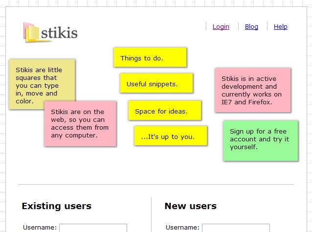
The main gimmick of the landing page is that it’s got some stikis at the top that describe what the site is. You can click on these, move them, and resize them. Below them, I’ve rearranged the login and sign-up forms into a two-column layout.
It’s obviously a risk putting all that javascript up-front on the landing page. It increases the load time and there’s the risk that an error will render the page unusable. However, if it works, I think it’s a very effective way of communicating not just the features of the site, but also something of the quality of the interaction (and whether it will work on their browser).
There’s also something about playing with those little blurbs that helps cut through the cheesiness of them. If I were to read “Space for your ideas” on a website I’d think “gimme a break” but when you start playing around with them hopefully you can kind of see what that cheesy marketing speak is trying to say.
Another change which is fairly minor is the addition of a footer with the following request; “Please tell me how to make stikis better.” I’m really hoping I’ll get some feedback from users as a result of this and I think it’s important to let people see who I am and understand that the site is a one-person project.
Zoom, pan, select, chuck
Quite a big update to the user interface yesterday, which changes the way the interface works a bit. There are four new features:
Zoom
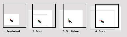
You could zoom the page in the previous version of the site, but only using the buttons at the top of the page, (below).

Those buttons are still there, but now you can also zoom using the scrollwheel of your mouse. It’s similar to the way zooming is done in map sites (eg. Google maps) so hopefully at least some users will be familiar with it. The way it works is when your mouse is over the page, you scroll up or down and the page zooms in and out on that spot. A target will appear to show where you are zooming to. The image below shows the target on a page that is in the process of zooming.
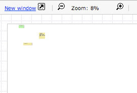
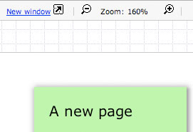
I’ve also added some constraints on how far you can zoom. Previously, you could just keep zooming further and further out or in, which was kind of pointess and lead to people not knowing where they were any more. Now you can zoom out to 8% and in to 160%, as the following two images show.
Hijacking the scrollwheel is not something I’d do lightly. However, I feel there are valid reasons for doing so in this case. First, there’s an established use of this in map software which some users will be familiar with. Second, the previous method of zooming by clicking buttons was tedious and didn’t give you controll over where you zoomed in on. Third, the traditional use of a scrollwheel in a webpage is to scroll down the lines of a vertical document. In this case, the document stretches in both vertical and horizontal dimensions, and moving horizontally required the user to use the scrollbar, or use the scroll-pan (is that what it’s called?) function. Neither of these were very satisfying.
There are still some improvements I’d like to make to the scroll-zooming. A big one is letting you zoom more by scrolling more. At the moment you have to scroll, then zoom a bit, then scroll again, then zoom some more. It frustrating to zoom more than two steps.
Pan
Okay, so I hijacked the scrollwheel. Even though there were some good reasons for that, I needed to give people another way to move around the page. The solution I’ve added in this release is to allow panning by clicking and dragging on the background of the page. Like the scroll-zoom feature, this is in common use on map sites and it’s also well established in graphics programs (such as photoshop) and the Adobe reader software.
After poking around a bit, I found that the CSS3 proposal includes cursors ‘grab’ and ‘grabbing’ (below) which are a nice fit with the established use. The idea is that you use the ‘grab’ cursor to indicate that something can be moved, and then the ‘grabbing’ cursor to indicate that the user ‘has a hold’ of it and can move it around.


Fortunately, Firefox (one of my target browsers) supports these cursors through the -moz-grab and -moz-grabbing declarations. Unfortunately, IE7 (my other target browser) does not. Fortunately, it’s possible to specify a custom image to use at the cursor using the following markup.
1
2
#target {cursor: url(/path/to/grab.cur), default;}
#target:active {cursor: url(/path/to/grabbing.cur), default;}
When the target element is active, the cursor should be changed from ‘grab’ to ‘grabbing’. This works for me on Firefox, but I couldn’t get it to work in IE7, so in that browser, the user only ever sees the grab cursor.
Another point to mention with this is that the files need to be in *.cur format. From what I can gather, this is similar to the *.ico format which is used for icons. I used a freeware program to turn the example gifs on the Mozilla website into the cur format.
Select
It’s been possible to select multiple stikis for a while now by holding down the control key and clicking on them. This worked fine if you only needed to select two or three stikis, but it was very tedious for large numbers of stikis. For a long time, I’ve had plans to implement a select box function, similar to what’s used in graphics programs.
The usage is fairly straight-forward, you hold down the control key and click and drag with the mouse to draw a select box. Any stikis that overlap with the box will be added to the selection.
Chuck
With the ‘chuck’ function you can select a stiki (or stikis) press Control+Shift and an arrow key and the stiki will be swooshed off to the edge of the page in the direction you specified.
This function grew out of my experience of using the stikis as reminders of things I need to do. I found it convenient to move the stiki off the side of the page once I had completed the task, but it was a pain to have to zoom out and move it to the edge using the mouse. I just wanted a quick way to ‘chuck’ it. And so another keyboard shortcut was born.
Summing up
My aim with stikis is to have an experience where you can move around and zoom in and out without feeling like it’s a chore. If you want to get an overview, you should be able to skip right out and see the big picture. If you want to narrow in on a single thought that should be easy too. The interface still isn’t at the level I want it to be, but I think these additions are a step in the right direction. If you’ve used the previous version, I’d love to hear your reactions to the changes. If you’re a new user, let me know what you think.
Forum installed
I’ve installed a forum to serve as a discussion area for the project. The URL is: forum.stikis.com
The forum runs on phpBB. I’ve not had much experience using this forum software, I just chose it because it’s available as a one-click install on my ISP. In the end, it’d be nice to be able to use stikis.com itself for this kind of thing. But until I’ve implemented multiuser pages it’s not possible. Besides, for something like a forum: where users might be going to find help about how to use the system, it’s probably not a good idea to force them to use the system itself.
I’ll look at updating the look of the forum (along with the help wiki, and this blog) to give a more consistent presentation.