While I was I writing this post, the list of people that are signed up to stikis has gone from being mostly people I know, to mostly people I don’t know. That’s kind of a weird feeling. It’s mainly thanks to myopenid.com, who listed stikis on their directory last week.
Getting people coming to the site from _the wild _ meant that the old sign in page (three bare forms with no explanatory text) was totally inadequate. So after months of embarassment every time I log in to stikis.com, I’ve finally gotten to the task of creating a proper landing page for the site. As usual, the landing page is just a step in the right direction rather than a fait accompli. But I think it has some nice features all the same. Here’s a screenshot.
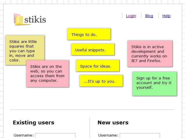
The main gimmick of the landing page is that it’s got some stikis at the top that describe what the site is. You can click on these, move them, and resize them. Below them, I’ve rearranged the login and sign-up forms into a two-column layout.
It’s obviously a risk putting all that javascript up-front on the landing page. It increases the load time and there’s the risk that an error will render the page unusable. However, if it works, I think it’s a very effective way of communicating not just the features of the site, but also something of the quality of the interaction (and whether it will work on their browser).
There’s also something about playing with those little blurbs that helps cut through the cheesiness of them. If I were to read “Space for your ideas” on a website I’d think “gimme a break” but when you start playing around with them hopefully you can kind of see what that cheesy marketing speak is trying to say.
Another change which is fairly minor is the addition of a footer with the following request; “Please tell me how to make stikis better.” I’m really hoping I’ll get some feedback from users as a result of this and I think it’s important to let people see who I am and understand that the site is a one-person project.