Summary: Asymmetric Division of Labor...
A summary of:
Guiard, Y., 1987. Asymmetric division of labor in human skilled bimanual action: The kinematic chain as a model. Journal of Motor Behavior, 19(4), 486-517 (online article).

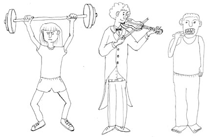
This paper proposes a kinematic chain model for describing the relationship and functioning of the hands in asymmetric bi-manual tasks. As shown in the illustration above, these are tasks such as playing a violin where both hands are engaged in the task, but carry out different functions. They may be contrasted with unimanual tasks, such as tooth-brushing, where one hand is primarily engaged in the action while the other hand remains passive symmetric bi-manual tasks, such as weight-lifting where both hands are engaged, but undertake the same task. The author states that previous research had focussed mainly on unimanual tasks and that though bi-manual tasks had recently become a topic of interests for experimental psychologists, the focus there was mainly on symmetric bi-manual tasks. The area of bi-manual asymmetric tasks had, by contrast received less attention from researchers and is the focus for this paper.
The author goes on to show that in bi-manual tasks such as hand-writing, or swinging a golf-club, the relationship between the functions of the hands is not simply that one hand is skilled and the other unskilled, but that one hand delineates ‘frames’ on a macrometric scale within which the other hand can insert ‘contents’ on a micrometric scale. In the case of a right-handed person hand-writing, this refers to the way that the left-hand positions and steadies the paper for the right-hand to make marks on it. This positioning is not like a clamp rigidly holding the paper still, but a ‘plastic stability’, where the position of the paper is constantly adjusted to fit with the unfolding task. So where the right-hand (of a right-hander) exhibits fine temporal and spatial resolution, the left-hand provides the coarser temporal and spatial framings for this.
As an abstract model of this relationship, the author proposes a kinematic chain, where each arm is modeled as an abstract motor and their functioning is chained such that the coarser temporal and spatial actions of one arm (the left arm of a right-hander) feed in to the finer temporal and spatial actions of the other (the right arm of a right-hander). To understand what this means, it’s first easier to think of a single arm, like a robot arm that is driven by one motor at the shoulder and another at the wrist. The motor at the shoulder will be the best for providing the big positioning movements of the hand, while the one at the wrist will be the best for finer positioning movements.
Summary: Tangible Products
A summary of:
Djajadiningrat, T. et al., 2004. Tangible products: redressing the balance between appearance and action. Personal Ubiquitous Comput., 8(5), 294-309. (online article)

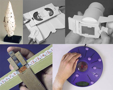
Figure 1: Design examples clockwise from top left - Oposite poles exercise, tapedeck, digital camera, alarm clock, heating programmer (from Djajadiningrat et. al 2004).
This paper discusses several design examples from the authors’ research which explore notions of meaning and aesthetics in interaction design. They work from a Gibsonian ecological psychology perspective, but approach it in an original way. Rather than focusing on affordances as invitations to action, they look beyond this to ways of communicating what the result of the action will be. They refer to this concept as ‘feedforward’ and seek to create a meaningful relationship between appearance, action and function.
Whereas designs would usually communicate what the results of actions will be by using icons or text (a semantic approach which emphasises cognitive skills), the authors seek to communicate this through the action, affordances, feedback and tangible qualities of the interface (a direct approach, which emphasises perceptual-motor and emotional skills).
They present five design examples through which they have explored these ideas.
- Opposite poles: A student design exercise to express qualities in physical form.
- Videodeck: A video tape player and recorder concept which explored how the form of controls could be used do differentiate them and communicate the required actions.
- Digital camera: A concept which explored the relationship between physical forms, component relationships and product functionality.
- Heating controller: A programmable heating controller which demonstrated the possibility for making the programming of a heating system a fluid physical action and explored unity in input and output of the device.
- **Alarm clock: **A concept which left open the precise manner in which a person could program it and thereby allowed for the possibility of emotional and aesthetic expression.
The paper ends with a reflection on and critique of the wider field of tangible interaction. First, they suggest that natural mapping is used by too many interfaces in tangible interaction and that though this approach can work well for some applications, there are many others for which it falls short. Secondly, they criticize the tendency in many tangible interfaces to use identical looking blocks which are used to interact with the system. They reflect that much tangible interaction research is actually ‘GUI thinking in disguise’, where an essentially 2D interaction paradigm has been minimally extruded into a physical form.
Summary: Aspects of Everyday Design
A summary of:
Wakkary, R. & Maestri, L., 2008. Aspects of Everyday Design: Resourcefulness, Adaptation, and Emergence. International Journal of Human-Computer Interaction, 24(5), 478-491 (online article).
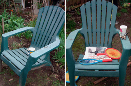
 Figure 1: Using lawn chairs as temporary tables (from Wakkary & Maestri 2008).
This paper describes the results of an ethnographic study of the use of artifacts in a domestic setting. Rather than focusing on how artifacts support a particular task (e.g. supporting communication), they instead examined how people engage in processes of appropriation and design of artifacts to incorporate them in everyday practices. They refer to this process as ‘everyday design’, and relate it to John Dewey’s notion of constant doing and undergoing, whereby we both adjust to our surroundings and adjust our surroundings to us (Dewey 1934).
The method used for studying people’s everyday design was something the researchers refer to as ‘design ethnography’. When I read this term, I imagined a process that utilized the practice of design as a way of understanding aspects of participant’s practice. However, I was a little disappointed that this is (seemingly) not the case. The authors present their concept of design ethnography in terms of how it is distinct from (regular) ethnography. The difference being that
"...the main aim is not to create holistic representations of entire cultures or subgroups, but rather the focus is on generating accounts of specific social activities and interactions in which design is present within the observed interplay of artifacts, people, and contexts" (Wakkary & Maestri, 2008 p.49).
The results of the design ethnography were developed and refined within the framework of a ‘pattern language’ (Alexander 1964) that emerged with the findings. This approach is in line with several other ethnographic studies of domestic life, such as (Crabtree, A et. al 2002).
The authors present their observations of people’s everyday design (patterns) clustered around the following three groups:
-
Resourcefulness: Appropriating artefacts and using them in expedient ways.
-
Adaptation: How the actions of various members of a household differ in how they relate to the established patterns of use and how individual’s actions can provoke or invite change in these patterns.
-
Emergence: Artifacts and the patterns of use that surround them can evolve over time to the extent where some change in the form of the original artifact becomes necessary.
Each of these clusters is illustrated in the paper with observations and excerpts from the field material. An example from the theme of ‘Resourcefulness’ was that one couple used garden chairs as makeshift tables (figure 1, above). In most cases, such use is opportunistic and not stable, but in some cases, routines of unorthodox use may emerge, such as when a child in a house used a shelf as a step to be able to reach up and put glasses away in the cupboard. Another example, used for the ‘Emergence’ theme was of a woman who was given a Filofax planner by a friend, but never actually used it in the intended manner. Instead, she adapted it to fit her own style and developed new patterns of use around it. Instead of using the pre-defined categories, she began using post-it notes to stick in to the pages of the diary, which allowed her to continue using the diary even after pages had been used. Later, she developed a new set of practices and artifacts for keeping track of notes that didn’t involve the planner at all.
The conclusion of the paper is that we should reconsider notions of use, and the user away from predefined relations and roles between people and artifacts. Rather than seeking to define and predict use (what technology can do for us), we can try to open up for people to act as creative agents, (what people can do with technology).
Welcome Firefox 3 (and Safari 3)
Last week saw the release of Firefox 3 onto the web. So on ‘download day’, I joined the thronging millions to grab my very own copy. Now which site do you think I was first to visit with my prize? Stikis of course!
I excitedly typed in the address, logged in and arrived back at my last stikis page. Then… (cue sound-effect of nuclear reactors powering down)…nothing. Aargh, a compatibility bug in the script that hooks up the color patches. It meant that nothing on the page worked.
I know I should have downloaded the beta and tested it with stikis before the release date, but…well there was that pesky thesis to get out of the way :) and you’d expect Firefox 3 to work with stikis if Firefox 2 does…right? Wrong.
However, the bugs were fairly minor and yesterday I was able to make an update to the site that fixes them. An upshot of this was that Stikis now also plays nicely with Safari 3.
If either of these is your browser of choice, Welcome to Stikis!
Update to zooming
Today, I’d like to announce the first update to stikis since submitting my PhD thesis (woohoo!). That news probably deserves a blog-post of its own, so straight to the business at hand.
I have tweaked the zoom levels a little. Previously, pages would zoom to 8%, 16%, 32%, 64%, 100%, and 160%. There were a couple of problems with this.
- There were more settings than needed. It only really needs three settings, one for focusing on a single stiki, one for arranging several stikis, and one for getting a big overview.
- It felt slow to zoom out or in, because you needed to zoom through several presets.
- Text was unreadable at 64% or less, so the majority of settings weren’t much use.
- The numbers are a little difficult to remember (unless you’re into powers of two).
So the new zoom levels are (drum-roll please) 20%, 100%, and 200%. They don’t correspond directly to the old zoom scales because I moved the underlying zoom level up a bit. 100% is actually the same as 70% before.
That probably all sounds pretty confusing. Hopefully, most people won’t need to notice or worry about it.
